In summary:
- Making the leap from traditional to digital art feels alien because it’s a sensory, not a technical, problem.
- Success isn’t about buying expensive gear, but about recreating the physical feedback of traditional tools.
- You can build a professional-grade digital setup that mimics your painting workflow for under $500.
- Mastering layers, resolution, and color calibration are the keys to translating your existing skills to the screen.
There’s a unique feeling to a loaded brush meeting a gessoed canvas—a slight drag, a physical resistance that informs every stroke. The scent of turpentine and oil paint hangs in the air. For a traditional artist, this sensory feedback is the language of creation. Then comes the digital screen: a cold, slick, unforgiving sheet of glass. The disconnect is jarring. Many guides will tell you to simply “buy a tablet” and “learn the software,” listing features without addressing this fundamental chasm.
They focus on the tools, not the artist. They talk about the convenience of the “undo” button but ignore the loss of muscle memory and intuition you’ve spent years, or even decades, cultivating. What if the secret to a successful transition wasn’t about mastering new technology, but about translating your existing, hard-won skills into a new digital medium? It’s not about replacing your toolbox; it’s about learning to mimic your physical workflow on a digital canvas.
This guide is built on that principle. We won’t just list products. We’ll deconstruct the core challenges a traditional painter faces—the slippery feel, the foreignness of layers, the fear of a bad print—and provide a strategic, budget-conscious roadmap. We’ll show you how to build a setup and a workflow that honors your traditional background, all for under $500.
To navigate this transition effectively, this article breaks down the essential steps and considerations. The following summary outlines the key areas we will explore to help you move from canvas to screen with confidence.
Summary: A Painter’s Roadmap to Digital Art
- Why oil painters struggle with the “slippery” feel of glass screens?
- How to organize layers in Photoshop to mimic traditional glazing techniques?
- iPad Pro vs. Wacom Intuos: which is better for a sketching workflow?
- The pixelation error that ruins digital art prints for gallery sale
- Calibrating your monitor: ensuring your digital colors match your printed output
- Interactive screens vs. Whiteboards: which tool drives better engagement in hubs?
- Why adopting disruptive tech too early kills cash flow for 70% of startups?
- Integrating Disruptive Technologies Without Bankrupting Your Startup: A Strategic Approach
Why oil painters struggle with the “slippery” feel of glass screens?
The primary reason traditional painters feel disoriented on a digital tablet is the loss of haptic feedback. An oil painter relies on the subtle drag of bristles against the tooth of the canvas. This friction provides control and informs pressure. A glass screen, by contrast, offers virtually zero resistance. Your stylus glides across it effortlessly, causing strokes to feel unpredictable and disconnected from your hand’s movement. This lack of a physical feedback loop breaks the “digital muscle memory” you’re trying to build.
The solution isn’t to practice until it feels “normal”; it’s to introduce intentional friction back into your process. You need to re-create that tactile sensation to regain control. Fortunately, there are several budget-friendly ways to achieve this and bridge the sensory gap. From screen protectors to custom nibs, these adjustments are the single most important first step for any traditional artist going digital.
Case Study: The Quest for the Perfect ‘Paper’ Feel
After years of working with digital artists, the developers behind Rock Paper Pencil learned that precision is everything. Artists reported that what they missed most from traditional media was the feeling of control. The product was engineered to provide smooth, controlled strokes that feel like writing on paper, not a slippery screen. This focus on recreating a familiar texture highlights a universal need among transitioning artists: the technology should adapt to the artist’s intuition, not the other way around.
Here are five immediate, cost-effective ways to add that crucial friction to your setup:
- Apply a paper-feel screen protector: Products from brands like Paperlike or ESR add a matte, textured surface to your tablet for an instant, paper-like feel. This is the most effective long-term solution, typically costing between $20 and $40.
- Use felt-tip or rubber nibs: Instead of the standard hard plastic stylus tip, switching to a felt or rubber nib provides more grip and a softer contact point on the screen. A pack of replacement nibs often costs under $15.
- Adjust software pressure curves: In your art software (like Procreate or Photoshop), you can customize the stylus pressure settings. Increasing the initial activation pressure requires you to press harder to make a mark, compensating for the slippery surface.
- Create custom brushes with higher friction: Most art programs allow you to create or modify brushes. Experiment with settings labeled “friction,” “drag,” or “resistance” to make your digital brush behave more like a physical one.
- Place a thin sheet of paper over the tablet: As a temporary, free solution, taping a single sheet of standard copy paper over your drawing area can help you practice strokes with familiar resistance. This is great for drills but not practical for finished work.
How to organize layers in Photoshop to mimic traditional glazing techniques?
Glazing is a classic oil painting technique where thin, transparent layers of paint are applied over an opaque underpainting (or “grisaille”) to build up rich color and depth. This methodical process seems lost in the direct, opaque world of default digital brushes. However, this is where a thoughtful approach to workflow mimicry becomes a superpower. Photoshop’s layer system is perfectly designed to replicate glazing, but it requires a specific, intentional setup.
Instead of thinking of layers as simple stacking elements, you must treat them as transparent films of color. By manipulating layer blend modes and opacity, you can achieve the same subtle color shifts and luminous effects of traditional glazing. This method allows you to separate your value structure (light and dark) from your color application, giving you immense control and a direct bridge from your classical training.
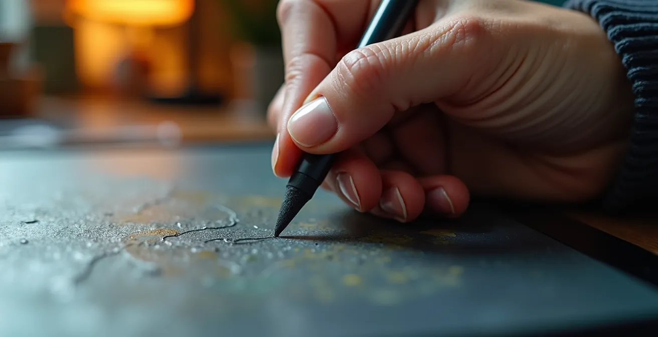
As the image suggests, the focus is on the structured process, not just the final stroke. The hand, stained with physical paint, uses the digital tool with the same intention as a traditional brush. The layer panel becomes your palette of transparent colors. Following a structured layer organization is key to making this translation successful.
Here is a step-by-step template for a digital glazing workflow:
- Base ‘Grisaille’ Layer: Create your complete underpainting in monochrome (greyscale) on a standard layer. This layer should be set to “Normal” blend mode at 100% opacity. This establishes your entire value and form structure.
- First ‘Glaze’ Layer: Create a new layer above the grisaille. Set this layer’s blend mode to “Color” or “Multiply” and lower its opacity to between 5-15%. Use this layer to apply your first, thin wash of color.
- Stack Multiple Glaze Layers: For each subsequent color, create a new layer. Continue to use blend modes like “Color,” “Multiply,” or “Overlay,” keeping the opacity low (typically 10-20%). This allows you to build up color richness without disturbing the underlying value structure.
- Use ‘Overlay’ for Temperature Shifts: To warm up highlights or cool down shadows without changing their value, use a layer set to “Overlay.” A light yellow on an Overlay layer will warm an area, while a pale blue will cool it.
- Group Your Layers: Keep your digital workspace tidy and understandable by grouping layers. Create a “Glazing” group for all your transparent layers and a separate “Direct Painting” or “Alla Prima” group for any opaque details you add at the end.
iPad Pro vs. Wacom Intuos: which is better for a sketching workflow?
The central tool debate for any artist moving to digital often boils down to two distinct workflows: drawing directly on a screen (like an iPad) or drawing on a screenless tablet while looking at a separate monitor (like a Wacom Intuos). With the expanding digital art market—where a 16.8% CAGR growth projected for digital artwork market through 2032 indicates a massive shift—making the right initial choice is critical. For the traditional artist on a budget, the “Pro” models are often out of reach. The real, practical choice is between a budget Wacom setup and a used or refurbished iPad.
The Wacom Intuos represents a more traditional, desk-based digital setup. It requires hand-eye coordination, as your hand draws in one place while your eyes look at another. This can be a steep learning curve but ultimately offers an ergonomic, stationary posture similar to working at an easel. The iPad, on the other hand, offers a more intuitive experience, much like a sketchbook. You draw directly where you see the mark appear, and its portability allows you to work anywhere. The choice depends entirely on your preferred working style and budget.
To clarify the decision for a total investment under $500, this table breaks down the costs and features of each path. The following comparison, inspired by analyses like those from institutions such as the Rocky Mountain College of Art + Design, shows that both are viable, but they serve very different artistic habits.
| Feature | Wacom Intuos Setup | Used iPad Setup |
|---|---|---|
| Initial Hardware Cost | Wacom Intuos S: $80 | Refurbished iPad 8th Gen: $300 |
| Software Cost | Clip Studio Paint Pro: $50 | Procreate: $13 |
| Stylus/Pen Cost | Included with tablet | Apple Pencil 1st Gen: $90 |
| Total Investment | $130 | $403 |
| Workflow Style | Fixed desk/easel position | Portable sketchbook style |
| Screen | Uses existing computer monitor | Direct on-screen drawing |
| Learning Curve | Hand-eye coordination challenge | More intuitive for traditional artists |
Ultimately, the Wacom Intuos path is the most budget-friendly and is excellent for artists who already have a computer and prefer a dedicated, ergonomic workspace. The iPad path offers a more seamless transition for those accustomed to drawing directly on paper and who value portability, though it comes at a higher initial cost.
The pixelation error that ruins digital art prints for gallery sale
There is no greater disappointment for a digital artist than spending weeks on a masterpiece, only to see it print as a blurry, pixelated mess. This common and costly error almost always stems from a misunderstanding of one crucial concept: print resolution, measured in PPI (Pixels Per Inch). Your screen displays images at a low resolution (typically 72 or 96 PPI), which looks sharp and clear. However, professional printing requires a much higher density of information, typically 300 PPI, to produce crisp, clear results.
If you create your artwork at screen resolution, you are not capturing enough data. When the printer tries to stretch that limited data over a physical surface, it’s forced to “invent” pixels, resulting in the dreaded blocky, jagged look. This completely undermines the perceived quality of your work and makes it unsuitable for gallery sale or professional portfolios. The key is to start your digital canvas with the final print in mind from the very first stroke. With nearly 29% of digital artists currently use AI in their creative processes, even new technologies for upscaling are becoming common, but they should be a last resort, not a primary strategy.
To avoid this pitfall, follow this safety checklist for every piece you intend to print:
- Start at 300 PPI: When creating a new canvas in your software, immediately set the resolution to 300 PPI (or DPI). This is non-negotiable for print work.
- Apply the ‘2X Rule’: If possible, create your digital file at double the dimensions of your largest intended print. For an 8×10″ print, work on a 16×20″ canvas at 300 PPI. This gives you maximum flexibility and quality.
- Save Masters in Lossless Formats: Never use JPEG for your master file. JPEGs are “lossy,” meaning they discard data every time you save them. Use lossless formats like PSD (Photoshop) or TIFF to preserve every pixel of information.
- Check ‘Image Size’ Correctly: In Photoshop’s “Image Size” dialog, uncheck the “Resample” box before checking your print dimensions. This shows you the true physical size of your image at its current resolution without adding or removing pixels.
- Use AI Upscaling as a Last Resort: If you have an old, low-resolution file that must be printed larger, use a dedicated AI tool like Topaz Gigapixel or Adobe’s Super Resolution. These tools are far more effective at intelligently enlarging images than standard software, but they can’t replace a high-resolution original.
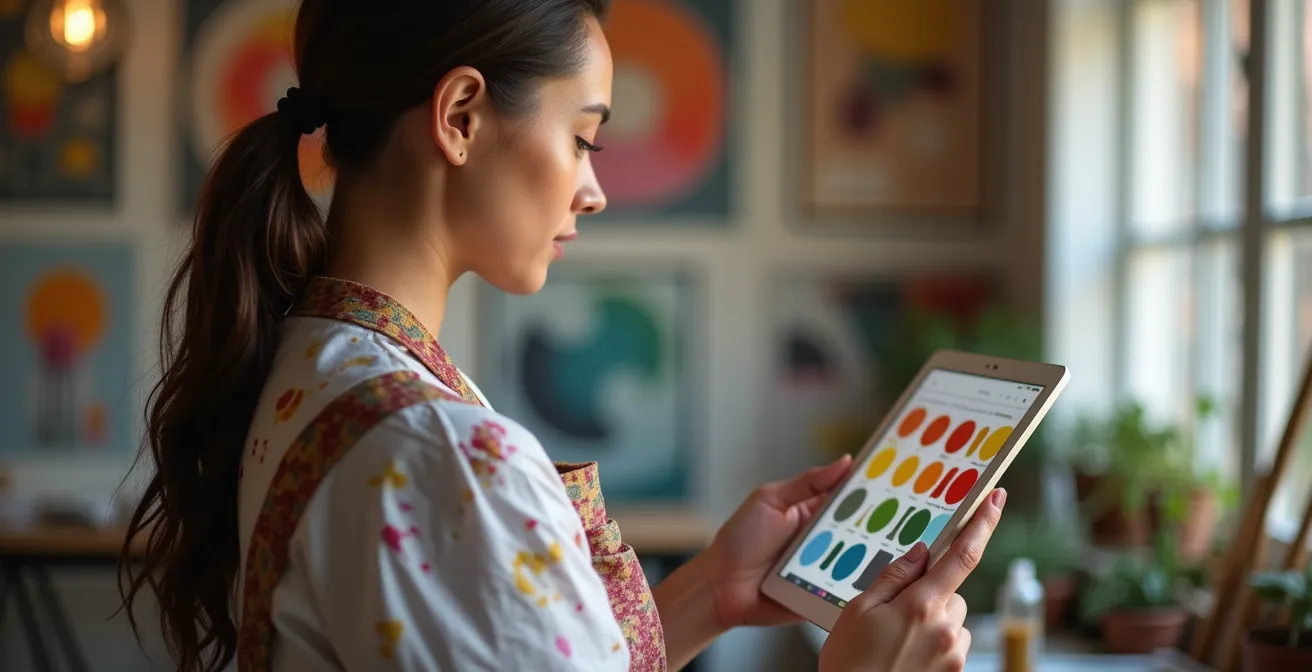
Calibrating your monitor: ensuring your digital colors match your printed output
The second great printing tragedy is the color mismatch: the vibrant, perfectly balanced painting on your screen comes back from the printer looking dull, dark, or with an ugly color cast. This happens because your monitor and a printer speak two different color languages. Your monitor creates color by projecting light (RGB – Red, Green, Blue), while a printer creates color by applying ink to paper (CMYK – Cyan, Magenta, Yellow, Black). Without a proper translation, the results are unpredictable.
Professional artists use expensive hardware calibrators to synchronize their screens with printers. However, for an artist on a budget, this is often an unjustifiable expense. The good news is you can achieve 80-90% of the accuracy with a “poor man’s” calibration method. This involves using a physical reference print from your chosen lab to manually adjust your monitor’s settings, ensuring what you see is as close as possible to what you’ll get.
This process of comparing a physical reference to your screen is the heart of budget calibration. You are creating a visual bridge between the digital and physical worlds. It requires a keen eye but is the most reliable way to gain control over your printed colors without investing in costly hardware. It’s a critical step that many artists skip, but one that adds immense professionalism to your final product.
Follow these steps to manually calibrate your monitor for printing:
- Order a Reference Print: Contact your intended print lab and ask for a reference print or color chart. This is a physical print with known color and greyscale values that you will use as your ground truth.
- Set Up in Neutral Lighting: Place the reference print next to your monitor in a room with neutral, diffused daylight (ideally from a north-facing window). Avoid direct sunlight or warm indoor lighting, which will skew your perception.
- Adjust Monitor Brightness: Open a blank white document on your screen. Adjust your monitor’s brightness setting until the white on the screen visually matches the white point on your physical print. It will likely be darker than you’re used to (professional studios use a brightness of 80-120 cd/m²).
- Fine-Tune RGB Channels: Looking at the greyscale and color patches on your reference print, adjust your monitor’s individual R, G, and B channels (in the monitor’s menu) until the on-screen colors match the physical print as closely as possible. The goal is to eliminate any obvious color cast (e.g., if your greys look too blue, slightly lower the blue channel).
- Enable Soft-Proofing: In Photoshop or a similar program, enable “soft-proofing.” This feature simulates how your image will look when printed. You’ll need to get the specific ICC profile for your lab’s printer (usually available on their website) and load it to get an accurate on-screen preview before you send the file.
Professional Galleries Embrace Digital Color
The art world is increasingly tackling the challenge of screen-based color. According to market analysis, galleries are investing in new ways to validate digital work. Reports show that hybrid-exhibition models are blending large-format projection with tokenized certificates, and traditional galleries are installing ultra-high-nit LED walls to display digital compositions accurately. This trend underscores the growing importance of color accuracy from creation to exhibition.
Interactive screens vs. Whiteboards: which tool drives better engagement in hubs?
In a corporate context, this question pits a digital smartboard against a traditional whiteboard for brainstorming. For a traditional artist, however, the “hub” is your own creative mind, and the tools are far more personal. The “interactive screen” is your new digital tablet, and the “whiteboard” is the tool you’ve used for years: your sketchbook. The real question is: which tool is better for the raw, initial stage of creation—the ideation and sketching phase?
Your sketchbook is a space of pure freedom. There are no menus, no tools, no resolution settings. It’s a direct, unfiltered conduit from your brain to your hand. This lack of friction is perfect for uninhibited ideation, capturing fleeting ideas, and exploring compositions without commitment. You engage with the paper, not an interface.
An interactive screen, or drawing tablet, introduces a layer of technology. While powerful, it can sometimes hinder that initial spark. You have to select a brush, a color, and a layer before you can even make a mark. However, it offers unparalleled flexibility for iterative development. A rough sketch can be instantly duplicated, resized, warped, and layered upon. This encourages experimentation in a non-destructive way that a sketchbook cannot match. The best approach is often a hybrid one: use the sketchbook for raw brainstorming and then move to the tablet to refine and develop those ideas.
Why adopting disruptive tech too early kills cash flow for 70% of startups?
This statistic about startups holds a powerful lesson for the individual artist. Think of your artistic career as a “startup of one.” Your cash flow is the money you have for supplies, marketing, and living expenses. “Disruptive tech” in the art world is that top-of-the-line, $3,000 pen display or the newest, most powerful computer. The allure is immense, promising a magical leap in quality and productivity.
However, adopting this expensive technology too early, before you’ve even mastered the fundamentals of a digital workflow, is a classic trap. It doesn’t just drain your bank account; it can create immense psychological pressure. You’ve made a huge investment, and now you feel obligated to create masterpieces to justify it. This “gear guilt” can lead to creative paralysis, where the fear of not being “good enough” for the tool prevents you from creating at all.
The smarter path is to start with a modest, budget-friendly setup, as outlined in this guide. A sub-$500 kit is more than capable of producing professional, gallery-quality work. Master the core skills on affordable gear: translating your stroke, managing layers, and controlling color. Once your skills—and hopefully, your art sales—begin to grow, you can then make a strategic, informed decision to upgrade. The technology should follow your skill, not the other way around.
Key takeaways
- Your primary focus should be on recreating the physical feel of traditional art by adding intentional friction to your digital surface.
- Leverage digital tools like layers and blend modes not as new features to learn, but as ways to directly mimic your existing techniques like glazing.
- A fully professional, budget-conscious digital art setup is achievable for under $500; expensive gear is a goal for the future, not a requirement to start.
Integrating Disruptive Technologies Without Bankrupting Your Startup: A Strategic Approach
For the traditional artist, “integrating disruptive technology” simply means welcoming digital tools into your creative life without letting them overwhelm you or your finances. This isn’t a technical challenge; it’s a strategic one. The goal is to build a hybrid workflow where your years of traditional skill enhance your digital work, and digital tools offer new efficiencies to your traditional process. A successful integration is incremental, intentional, and always in service of your art, not the technology itself.
The path to a sustainable digital art practice is paved with smart, small steps. It begins with solving the sensory disconnect, then moves to translating your specific painting techniques, and finally, to mastering the technical aspects of producing professional-grade output. By focusing on the “why” behind each tool and starting with a budget-friendly kit, you remove the financial pressure and create a space for genuine learning and experimentation. This allows you to grow into the technology at your own pace, ensuring that your tools remain a servant to your creativity, not its master.
Your Digital Transition Audit Plan
- Points of Contact: List every medium you use now (e.g., oil on canvas, charcoal on paper). What is the key sensory feedback from each (e.g., “brush drag,” “smudging”) that you need to replicate digitally?
- Collecte: Inventory your core traditional techniques (e.g., “grisaille underpainting,” “wet-on-wet blending,” “scumbling”). Research and find one specific digital brush or layer method that mimics each one.
- Cohérence: Does your chosen digital setup (e.g., Wacom at a desk vs. iPad on the go) align with your established creative habits and workspace? Confront whether the tool fits your life, or if you must change your life for the tool.
- Mémorabilité/émotion: Create a small test piece. Does the process feel like a chore, or are you finding moments of creative flow? Identify one specific part of the digital process that feels frustrating and one that feels empowering.
- Plan d’intégration: Based on your audit, create a 30-day plan. Week 1: Focus only on recreating feel. Week 2: Practice one glazing technique. Week 3: Complete a full piece for print. Week 4: Calibrate and print.
Your journey into digital art is a marathon, not a sprint. Start today by building your sub-$500 toolkit, focusing on mastering one technique at a time. This strategic and patient approach will allow you to successfully expand your artistic horizons without compromising your skills or your budget.